top of page

Fostering a community among diverse user groups.


Overview
Overview
Salesforce wants to foster a cohesive sense of community among diverse user groups on their online platform, Trailblazer Community. I collaborated with Salesforce on this project, during the spring semester of 2024.
Project scope
Developed four new features to boost engagement among new users in the Trailblazer Community, fostering a more inclusive and cohesive network. We conducted primary research through users interviews and reddit user feedback, secondary research through literature review, which drove our final concepts ideation.
Impact
Activities
Participant recruitment
User interviews
Qualitative analysis
UX & UI Design
Team
8 member team; 1st & 2nd year HCI grad students
Salesforce Trailblazer Research & Design team
Figma, Figjam, Google form
Tools
3 months
Timeline
Problem & Action
Problem
In its simplest form, the Trailblazer Community is a forum with a feed where Salesforce users can post queries regarding Salesforce products, while expert users provide guidance
Lack of participation & engagement of new users in the Trailblazer community, leading to a disconnect between new and seasoned expert users
Our research revealed that new users have low engagement in the Trailblazer community:
Trouble finding what they need in the community
Afraid to ask queries in the community due to fear of judgement
Uncertain about receiving answers in a timely manner
Action
Re-designing interactions for new users on the platform, to build a cohesive Trailblazer community
Dashboard to increase
ease of navigation
Smaller timed groups to erase fear of judgement
Posting wizard to receive quicker answers from experts
How did we do this?
Understanding the problem
Research methods
Conducted User interviews, Competitive Analysis and Digital Ethnography
6
User interviews
4 seasoned users and 2 new
users
6
Competitor platforms
Apple, Microsoft, Adobe, Reddit, Stack Overflow, and Quora
Online reviews
Reviews on platforms like Reddit, Quora and Youtube
Scoping
Defined new users as the primary user group, while seasoned expert users became the secondary
Our research revealed that New users in a community when provided with appropriate conditions become Seasoned expert users, hence Seasoned users become our secondary user group
Seasoned Users
Appropriate community conditions
New Users
Framework adapted from Lave & Wenger
Reseach
User stories
Synthesizing key user stories
Problem set 1
Open feed leads to fear of judgement, & skepticism in credibility of answers
Fear of judgement
Fear being misunderstood or sounding stupid while posting queries, since community feed is accessible to everyone
Uncertainty in timely answers
Lack of accountability on the feed to answer queries making users skeptical about receiving answers in a timely manner


Feed in Trailblazer community
Problem set 2

Overcrowded menu makes it difficult & time-consuming to find desired pages
Scattered navigation
Trouble finding desired pages due to presence
of too many options in the navigation bar
Navigation bar in Trailblazer community
How did we design for this?
Brainstorming
Brainstorming & Prioritization
Brainstormed for the uncovered insights and came up with 10+ concepts as a team

I know you can't see the concepts, this is to show our process :) View our ideations here
Prioritization
Prioritized major concepts with high impact, given our 8-member design team and timeline, focusing on features that would deliver the most value
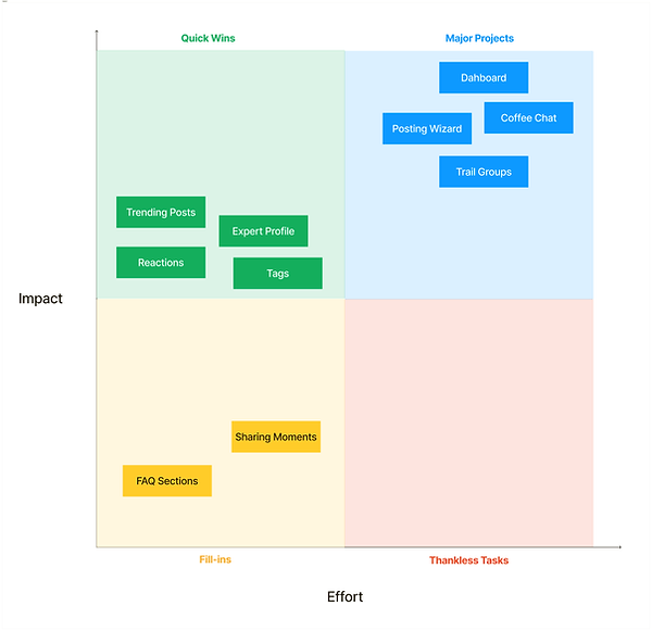
Minimal effort features, with medium impact; address user needs
High effort features, with high impact; address the core problems
Minimal effort features, with minimal impact; don't address core problems
Effort
Impact
Final design
Concept 1
1
Dashboard
Addressed user story: Trouble in finding answers due to scattered navigation
Makes navigation simple & clear
Includes all commonly accessed pages in a single screen
The community landing page has been redesigned as a dashboard, consolidating all the pages users frequently access into a single screen for easy navigation.

Ideation for Dashboard
1
F-layout to create a cleaner dashboard design; reduced visual clutter and guided the user's gaze through the most important components, such as topics and groups which users frequent.
Z layout
F layout


Shifted the most commonly accessed pages like topics & meetings to the right, as this section draws more attention while scanning in F layout
2
Reducing tile sizes as users don't need details about groups they are already part of; enhancing scrollability and navigation.
Initial iteration

Re-design

3
Defining the design language based on the existing Salesforce Lightening and Trailblazer design system


Used a 12 column grid to allow for scaling across different screen sizes. Set a 2 column grid with margins within and outside the grid container


Fixed percentages for each column to allow for scaling across screen sizes; followed Salesforce design system
Concept 2
2
AI Posting Wizard
Addressed user story: Uncertain about receiving timely answers
Recommends previously answered similar questions
Assigns queries to expert users
This delivers timely answers to new users
By suggesting previously answered similar questions, new users will be directed to quicker resolutions. In case a new question that isn't similar is asked, the user can assign the question to three expert users who are most likely to be able to help them in that field

You can view all our explorations for the Posting wizard here
Concept 3
3
Trail Groups
Addressed user story: Afraid to ask questions due to fear of judgement
Smaller, timed groups which reduce the fear of being judged
Creates a low pressure environment
Trail groups can be accessed by users taking similar courses on Salesforce’s LMS platform for a limited period of time. Trail Groups are in contrast to the current feed present on the platform, which is open to all users at all times.

Trail Groups accessible through the Dashboard
Final Design
Reflecion
Reflection
Take feedback & fail early, as it helps in understanding if a design aligns with users needs and aids in quick iteration.
While working with the Salesforce team, I learnt to have regular team check-ins and keep everyone in loop about the progress of the project. This ensured a continuous feedback loop, which allowed us to make changes quickly and get to where we wanted.
UI Design is a process to master. To create something aesthetically pleasing, consider factors like grid layouts, spacing, color schemes etc.
Designing something aesthetically pleasing involves balancing various elements, such as grid layouts, spacing, color schemes, typography, and visual hierarchy. These factors collectively contribute to creating a user interface that not only looks appealing but also enhances usability and functionality
When recruitment becomes tough for primary research methods like interviews, you can look at other forms of user research techniques like digital ethnography.
Oftentimes, the constrains of a project might not allow you to directly talk to users. In such cases, digital ethnography can provide rich qualitative data while overcoming recruitment barriers, offering a flexible way to understand users in their natural digital contexts.
Other projects


bottom of page